Line Graph or Scatter Plot? Automatic Selection of Methods for Visualizing Trends in Time Series
IEEE Transactions on Visualization and Computer Graphics 2017
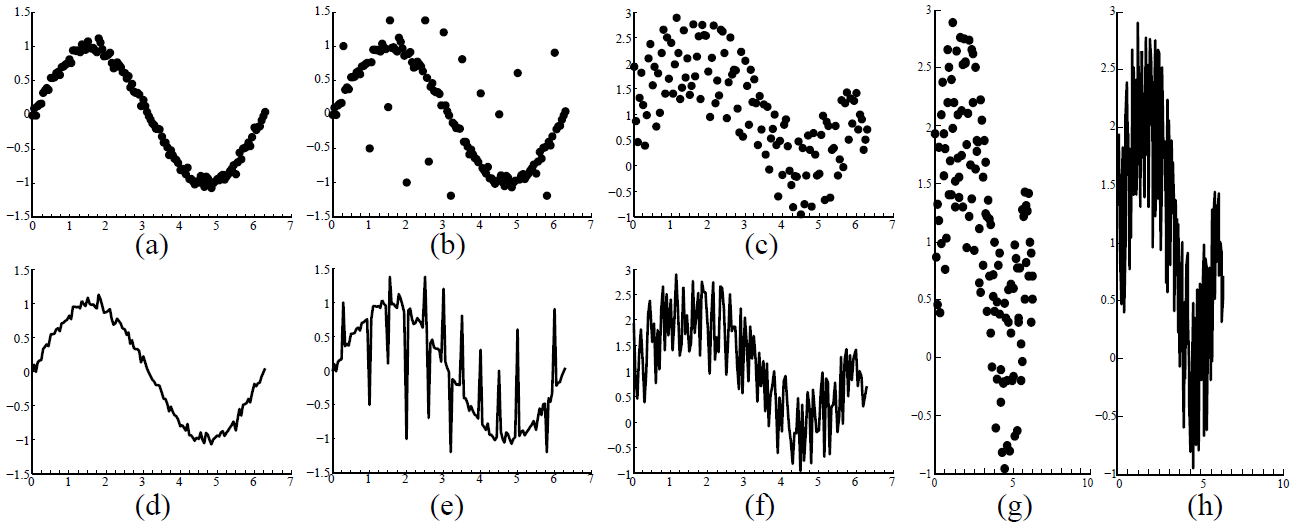
Figure 1: The right visualization choice for time-series data –scatter plots (a,b,c,g) or line graphs (d,e,f,h)– is related to the amount of noise and outliers in the data (a-f) and the aspect ratio of the given display area (g,h). When the amount of noise is small, the line chart in (d) is preferred due to its continuity, while the scatter plot in (c) more clearly represents the main trend for a large amount of noise. However, due to the presence of outliers, the trend shown in (b) is more visible than the one in (c), although the amount of noise is larger here. Besides such data dependent factors, visual variables also affect the choice. For example, the trend in a line graph becomes more salient as the aspect ratio increases from the one in subfigure (f) to the one in (h).
Abstract:
Line graphs usually are considered to be the best choice for visualizing time series data, whereas sometimes also scatter plots are used for showing main trends. So far there are no guidelines that indicate which of these visualization methods better allows the user to perceive trends in time series for a given canvas. Assuming that the main information in a time series is its overall trend, we propose an algorithm that automatically picks the visualization method that reveals this trend best. This is achieved by measuring the visual consistency between the trend curve represented by a LOESS fit and the trend described by a scatter plot or a line graph. To measure the consistency between our algorithm and user choices, we performed an empirical study with a series of controlled experiments. The results show a large correspondence. In a factor analysis, we furthermore demonstrate that various visual and data factors have effects on the preference for a certain type of visualization.Materials:
Paper: [PDF 5.7M].
Supp: [ZIP 15.5M].
Overview:
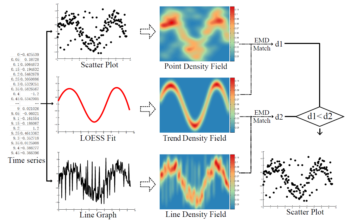
Figure 2: Overview of our method: given a time series, we generate three visualizations: a scatter plot, a trend curve represented by a LOESS fit and a line chart. Next, we transform the trend curve and the two visualizations into density fields. Finally, we match the density fields of the two visualizations to the density field of the trend function. The visualization with a smaller EMD distance is chosen.
Results:
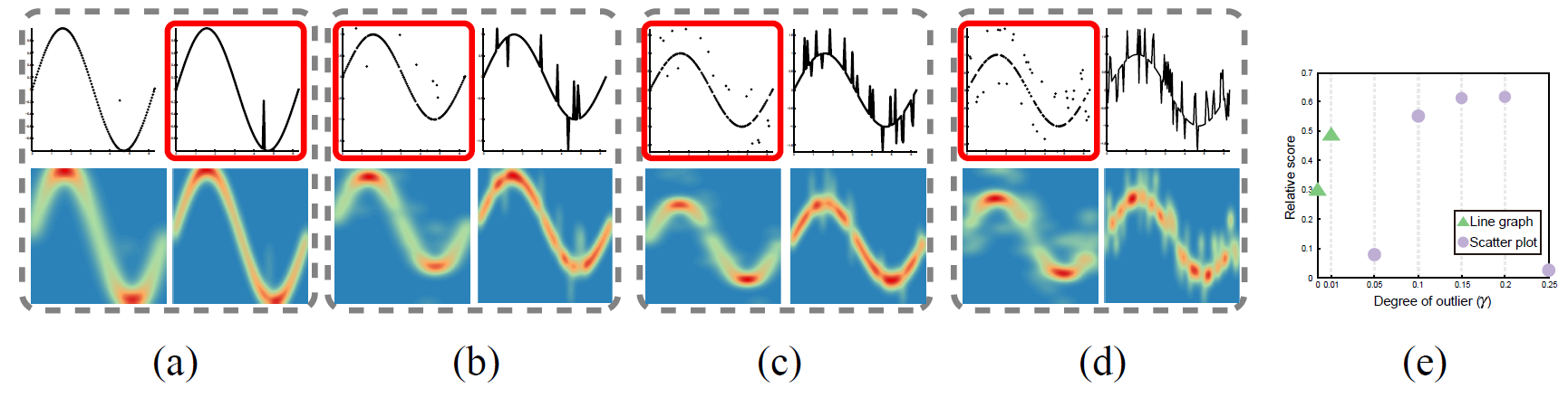
Figure 3: Overlaying different degrees of outliers γ on a sin(x) function: (a) 1%; (b) 5%; (c) 10%; (d) 25%. Each example consists of a scatter plot (top left), line graph (top right), the point density field (bottom left) and the line density field (bottom right). (e) Relative scores generated by using seven different γ. Green triangles indicate that the algorithm selected the line graph, violet circles the scatter plot. The visualizations selected by our algorithm are highlighted with red boxes.
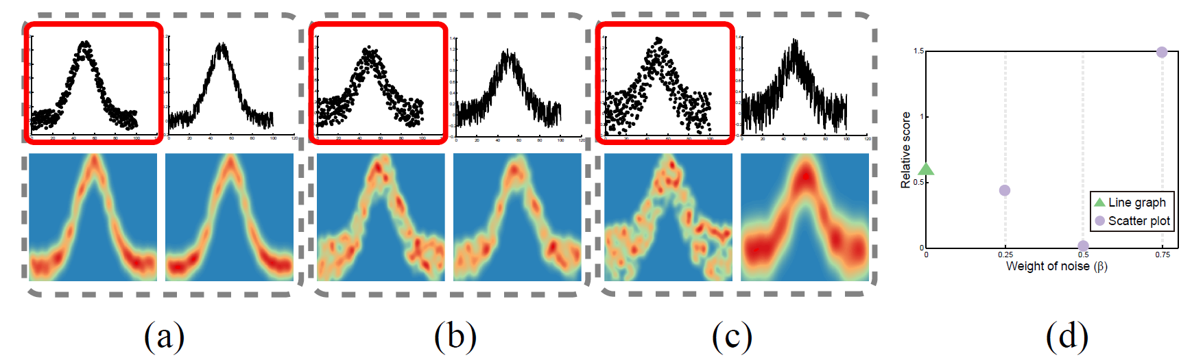
Figure 4: Overlaying noise on the trend function Gaussian(σ =5) with different weights β: (a) 0.25; (b) 0.5; (c) 0.75. Each example consists of a scatter plot (top left), line graph (top right), the point density field (bottom left) and the line density field (bottom right). (d) The relative scores generated by using four different β. Green triangles and violet circles indicate the algorithm selects the line graph and scatter plot , respectively. The visualizations selected by our algorithm are highlighted with red boxes.
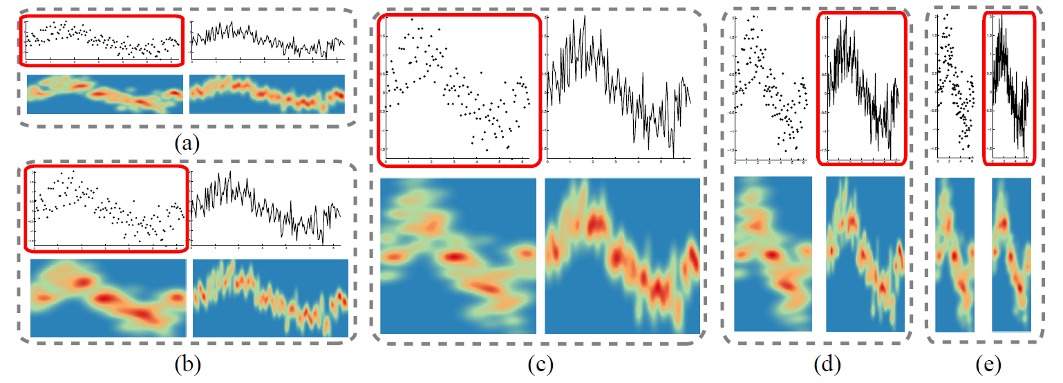
Figure 5: Visualizing the time series with different aspect ratio values: (a) 0.25; (b) 0.5; (c) 1; (d) 2; (e) 4. The algorithm choices highlighted with red boxes are scatter plots in (a,b,c), and the ones in (d,e) are line graphs. Each example consists of a scatter plot (top left), line graph (top right), the point density field (bottom left) and the line density field (bottom right).
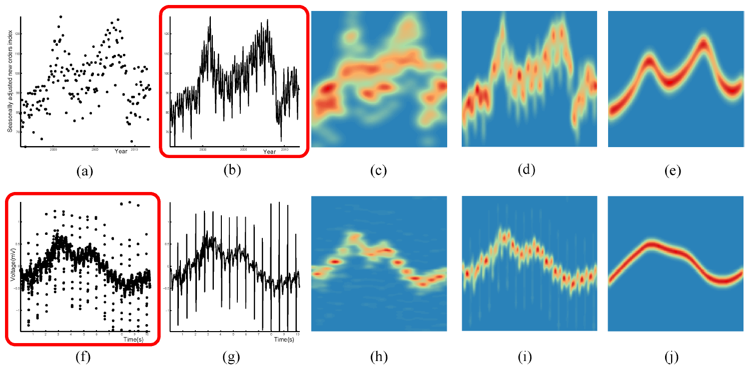
Figure 5: Selecting the visualization (highlighted with red box) that is more effective in revealing the overall trends of two real time series, which are shown in the first and second rows, respectively. (a,f) scatter plots; (b,g) line graphs; (c,h) point density fields; (d,i) line density fields; and (e,j) trend density fields.
Acknowledgement:
The authors would like to thank Justin Talbot for fruitful discussion and advice, Ove Daae Lampe and Helwig Hauser for providing the CDE code. This work is supported by the grants of NSFC-Guangdong Joint Fund (U1501255), 973 program (2015CB352501), NSFC-ISF(61561146397), NSFC(11271350), and the Fundamental Research Funds of Shandong University.